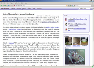
Website skin & organize
I put a few hours into the website this weekend. I'm really pleased with the new color palette. The blues look crisp, and the background has a hint of green that still reads like a white background, but makes the blue just a bit warmer. I think the rounded boxes look swank with the border and icons. The text is much cleaner and easier to read with the justification, font and spacing changes. The site flow-scales pretty well and the fonts can go up a zoom level without distorting the layout. I designed for 1024x768 which is still very common on laptops. It looks great on much larger resolutions as well.
I really put some time and word smithing into organizing the information. All the content areas have introductions. The about page is really fleshed out and current. I added credits referencing all the software and media I use to make this site.
There's always things to do though. I'd like to polish up the gallery to use some nice jquery or mootools scripting. I should go through the gallery, label the galleries, and elliminate dupes. The sidebar doesn't look as good in IE because of spacing issues. The email gateway's are still pretty coarse and could use some polish. My bookmarks are a mess (but a searchable mess). The linking in the recent area needs some work. Oh...and my resume is a year out of date.
